Motorola and special Android 12?
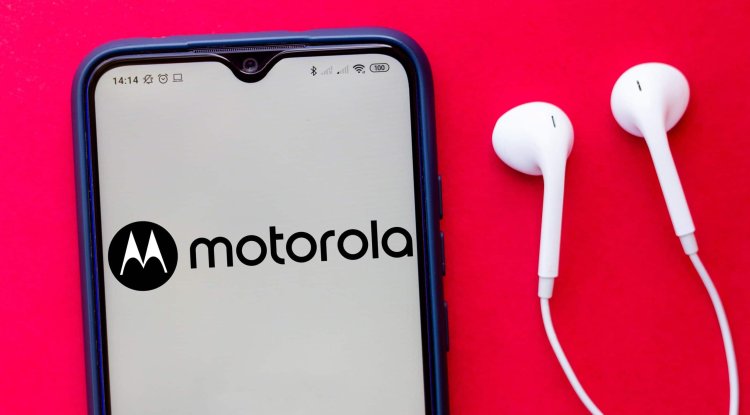
Motorola is one of the few companies that is fully committed to providing a pure Android experience to users of Motorola phones and don’t have duplicate applications and therefore work faster and more efficiently, while their operating system is closest to pure Android and works exactly as Google intended.
Instead of burdening the system with additional applications, Motorola has decided to further improve Android, and this is best reflected in My UX interface - a set of features that gives users control over the complete experience of using the phone.
My UX brings all the great Moto experiences, special apps and unique customization options that take your music, movies, games and phone look to the next level.
And since My UX doesn’t spoil the pure Android experience, users can enjoy the full range of new customization options that come with the Android 12 operating system. Material you?
It’s Google’s design language that takes everything Motorola started with My UX interface to a new level. The focus is on simplicity complemented by specific details that allow users to control Android 12 visual elements according to their taste. Best of all, all settings are located in one place. All it takes is to activate the Personalize option from the Home Screen menu to access all settings that include changing font style, color, icon shapes, sounds, displays and wallpapers.
Conversation Widgets
Brand new message widgets now allow you to put all your important conversations right in the center of the Home screen so you never miss them. Conversation Widgets even provides an insight into missed calls, birthdays and many other important notifications, all in just one glance from you.
User enhancements
Android 12 is designed to be even more affordable, and the following options stand out:
Enlarge a specific area: The new magnifier allows you to enlarge a specific part of the screen without losing context compared to the rest of the content on the display Additional dimming: The display can now be even dimmer when used at night or in situations where even the lowest screen brightness is too bright Bold text: The text is now even more readable with the option to be bold on the whole phone
Microphone and camera usage indicators
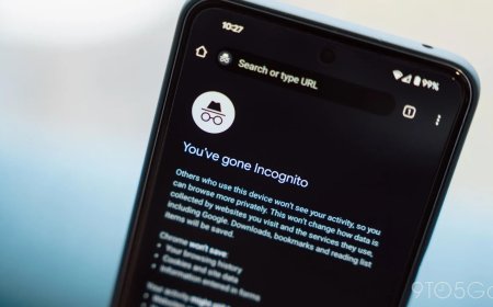
With Android 12, users can now clearly see which app is using the microphone or camera thanks to a special indicator located inside the Status bar. If you do not want an application to have access to the microphone and camera, you can disable these sensors thanks to special setup options.
Location protection
And while some apps need the exact location of your phone, such as navigation, many need it for completely different reasons that aren’t important to users. With Android 12, it is possible to choose whether the applications will get the exact or approximate location.
Privacy protection
A special Privacy Dashboard option provides a detailed insight into which app has accessed the location of your phone, camera, or microphone in the last 24 hours. If the user notices something that does not suit him, he can easily deny access to this data to a particular application.
Improved gaming
Android 12 now allows users to start with action while the game is downloading, without having to wait for the download to complete. And thanks to the Moto Gametime feature, there are advanced controls that allow you to block notifications, capture screens and control the sound while playing your favorite games. https://www.youtube.com/watch?v=H11-Hcpecm0&ab_channel=MotorolaUS
